How to Use Color Psychology in Cafe Interior Design for Maximum Customer Comfort
Creating the right atmosphere in your cafe relies heavily on the colors you select for the interior design. Whether you want a cozy, lively, or sophisticated feel, color psychology provides key insights that can affect mood and behavior. As an Interior designer in Ahmedabad, I’ve worked with many cafes to design spaces that not only attract customers but also help them feel comfortable and relaxed. At RS Design Studio, we specialize in creating interiors that reflect the soul of your business while ensuring maximum customer comfort. Let’s look at how you can apply color psychology to your cafe’s interior design for the highest level of comfort for your guests.
Understanding Color Psychology in Interior Design
Before we get into specific color choices, it’s important to understand what color psychology is. It’s the study of how colors affect human emotions and behavior. In a cafe, this can directly impact how customers feel when they arrive and how long they choose to stay.
Certain colors can encourage relaxation, while others can spark conversation or even boost appetite. As an interior designer for cafes in Ahmedabad, RS Design Studio ensures that every design element aligns with your cafe’s vibe, helping you make the right impact.
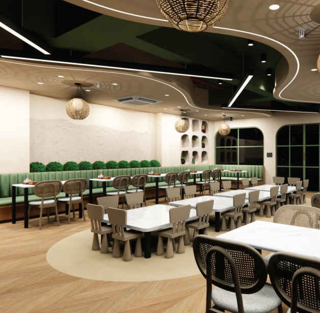
Colors That Promote Relaxation and Comfort
1. Soft Blues and Greens for a Calm Environment
If you want your cafe to be a space where customers feel calm and relaxed, blue and green are great options. Both colors have a soothing effect on the mind. They are perfect for cafes where people come to unwind, work, or engage in long conversations.
Soft blue shades are often linked to trust and peace, while green brings to mind nature and balance. A well-combined mix of these colors can turn your cafe into a tranquil escape from the city’s chaos.
Design Tip: Paint the walls soft blue and add natural elements, like potted plants or wall gardens, to strengthen a peaceful, nature-inspired setting.
2. Neutral Tones for Warmth and Comfort
Neutral colors such as beige, taupe, and off-white help to create a warm and welcoming atmosphere. These shades provide a flexible background for other design elements, like furniture, artwork, and lighting. When combined with earthy tones such as wood and stone, neutral colors give your cafe an organic and cozy feel.
Design Tip: Use neutral tones in your furniture, flooring, and in your café’s coffee bar area. Pair these with soft lighting to create a friendly atmosphere that feels like a second home.
Colors That Stimulate Appetite and Socialization
3. Warm Reds and Oranges for Energy
For cafes looking to encourage social interaction and stimulate appetite, red and orange are the go-to colors. Red is often associated with excitement and energy, while orange brings warmth and enthusiasm. Together, these colors foster an environment where people want to connect, chat, and stay longer.
However, be cautious with how much of these colors you use, as an overabundance can be overwhelming. Moderation is key when using these hues in your design.
Design Tip: Use red or orange as accent colors, like on feature walls, cushions, or decor items. This creates a lively focal point without crowding the space.
4. Yellow for Optimism and Appetite Stimulation
Yellow is a bright, cheerful color that boosts both appetite and positivity. It works well in a cafe where you want to create a lively and happy atmosphere. Research shows that yellow encourages a positive mindset, which is essential for a business focused on customer experience.
Design Tip: Use yellow as an accent color in signage, menu boards, or small decorative items. Combine it with neutral tones to balance its brightness.
Colors for Sophistication and Luxury
5. Rich Purples and Deep Blues for Elegance
If your cafe caters to a more upscale audience, using deep purple and navy blue can create a luxurious atmosphere. These colors are often related to royalty, exclusivity, and creativity, making them perfect for an intimate dining experience.
Design Tip: Add deep blue in your cafe’s seating area or accent walls. Pair it with gold or silver accents for a touch of elegance.
6. Black and White for a Modern Look
Black and white may seem like an odd combo, but together they offer a timeless, sophisticated, and minimalist vibe. These colors are ideal for cafes that want to showcase sleek, modern design without overwhelming customers with an array of colors.
Design Tip: Use black and white in your cafe’s logo, menu design, and other branding materials. A monochrome palette with splashes of color from accessories can give your cafe a polished and stylish look.
Implementing Color Psychology: Practical Tips for Your Cafe
1. Balance Is Key
While color psychology can guide your choices, it’s important to find a balance that aligns with your overall design theme. Too much of one color can create an overwhelming experience. Blend different hues to complement one another and create a harmonious space that meets various needs.
2. Consider Your Cafe’s Purpose
What kind of experience do you want to provide for your customers? Are you aiming for a relaxing area where people can unwind or a lively space for socializing? Knowing your cafe’s identity will help you choose the best colors to match that mood.
3. Lighting Matters
Lighting can affect how colors appear in your cafe. Natural light enhances colors, while dim or artificial lighting can create a more intimate and cozy feel. When planning your color scheme, consider how lighting will influence the overall look of your cafe.
At RS Design Studio, we blend the science of color psychology with creative interior design to craft spaces that leave lasting impressions. By carefully selecting the right colors, we can transform your cafe into a place where your customers feel comfortable, relaxed, and inspired to stay longer.